
ECRS SELF-CHECKOUT SYSTEM

ECRS is a grocery store retail technology company focused on point-of-sale (POS) technology and online grocery checkouts. This case study showcases the redesign of ECRS's self-checkout system, aiming for a cleaner, user-friendly experience for diverse user groups.
➷ Solo User Experience (UX) Designer working with two technical writers. This project was designed in Figma between December 2021 to February 2022.
ECRS's prior self-checkout interface lacked modernity and essential functions, complicating usability for customers and employees alike.
Problem
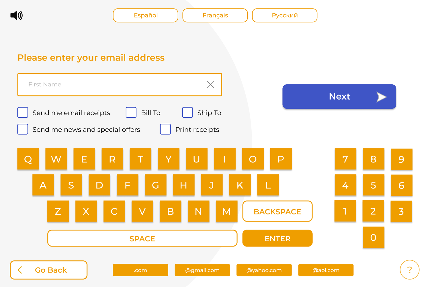
The redesign introduces a streamlined layout with expanded functionalities like account management, customizable themes, and user flows designed to enhance efficiency, catering to varying user demographics and improving the self-checkout experience.
Solution

identification of Users
Self-checkout systems are used by customers of all ages, grocery store employees, technicians, and more. Whether an elderly man, busy mother, or bored teenager walks into the store, they should be able to quickly use self-checkout in an efficient and meaningful way. Store employees need to be able to use the system to assist in troubleshooting, account setup, and other functions that make the shopping process easy for all.


-
Peripheral devices: For self-checkout systems to verify identity, accept payments, and complete transactions, the interface has to be set up to support and inform peripheral devices
-
Being the only designer is hard, especially when it’s your first time
Asking clarifying questions early on can limit trouble in the future
Keep in mind what people will likely do vs. what you want them to do
A good user interface can go unnoticed; a bad one will not
You can tell when something is designed by developers vs. designers
Don’t work over your design iterations, create new ones to track progress
-
How do we know this design is better?
As of now, we don’t. However, user testing would be rather easy. Whether observational or through screen time tracking, a good test would be to see how long it takes people of different age groups and backgrounds to complete the same task on the new system versus the old system. For example:
How long does it take an 18 y/o, 30 y/o, and 60 y/o to check out five items? Ten? Fifteen?
On average, how long does it take customers to create a new account?
How long does it take the same people to add $5 cash to their account?
How long does it take the newest and oldest employees to respond to a customer’s request during their shift?
On average, how long does it take employees to create an employee account? Are there outliers?
Doing usability tests to see how long it takes users to complete certain tasks allows us to see what design changes and improvements can be made so that common problems can be easily fixed.