the black history that isn’t taught.
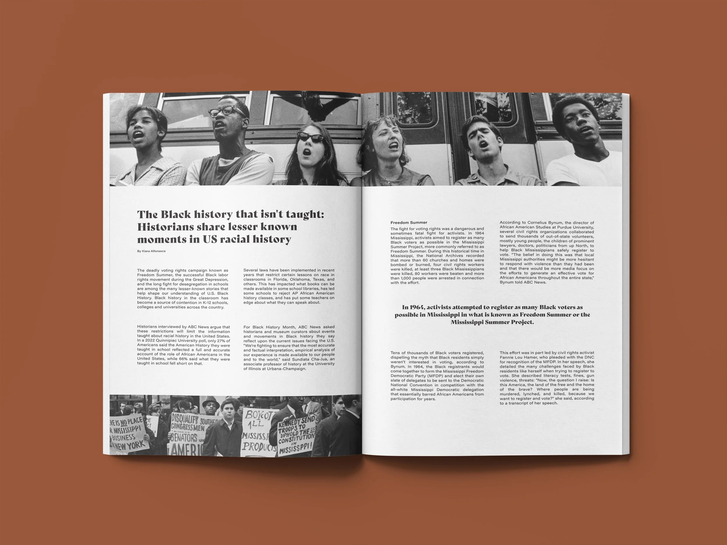
For this project, I designed a magazine article spread based on an article about moments in Black history that aren’t taught in schools. I chose this article because Black history is my history, and there were (and still are) movements and laws aiming to ban the teaching of Black history in general. While only two pages, I wanted this spread to convey power in both words and images, and I started that by creating a moodboard.
magazine article spread.
-
Since this was a typography project, I knew I wanted the title to stand out. I tried out bold serif and blocky, large sans serif, but nothing stuck out. I couldn't find a font that stuck out to me until I went pages deep into Adobe Fonts. That's where I found Bely, a typeface described as "a classy throwback text font family with a fearless and venturesome display". Once I saw Bely Display in particular, I knew I had found the typeface I wanted to use for my heading. From there, it took a lot of iterations of body text styles for me to decide what to use to complement it, and ultimately, I went simple with Acumin Pro Wide.
-
Adobe InDesign, Adobe Illustrator, Adobe Photoshop
-
ABC News article by Kiara Alfonseca
https://abcnews.com/US/black-history-taught-historians-share-lesser-moments-uss/story?id=106826076